

Before we start with anything below, I have two things to say: 1) this blog post is completely a personal opinion and feelings on things that I feel are good or bad, and 2) criticism is not to be equated as dislike of the channel in general, for some creators I truly like can still have thumbnails that I think suck ass. Very few angels on the internet.
Of all the websites that I have seen and perused since 2004, YouTube surely ranks as #1. And back then, websites were scrambling to get attention, and YouTube knew the game from the start – hit hard, hit fast. Features go out fast, attract users faster. And it got me watching there for at least a decade and a half.
It was a very nice site (at least, from the start before they went full ads) that showed videos of almost anything and everything under the sun. It has been an essential tool for people to know things visually, and it has been fascinating to see it evolve over the years, along with the creators that started to make a living on the platform. Some good, some bad, but at least it always moved forward and changed.
And the homepage was always a comforting place to start there. The site allows me to log in to “identify” me and my preferences. And when I go to the homepage, it shows me an algorithm-curated list of videos and playlists of videos that it assumes I will like to view based on a lot of factors. Refreshing the page shows me another new set. And that list of videos has a starting set of hooks: title and thumbnail.
In my opinion, a good first impression in a fast-paced and little-patience internet society is essential. Mess up both and the video views will likely be viewed way less. Mess just one of the two and the video might still survive. Mess none and the channel might be on track to become a checkmark, rack up 100K views and cultivate a healthy community.
But a “good impression” is completely subjective. What’s medicine for Peter might be poison for Paul, one might say. Titles and/or thumbnails that were objectively good might earn shitty blowback from self-righteous joy vampires that live in Cancelvania. Conversely, terrible titles and/or thumnbails could give bigots and racists a hard-on. What I’m trying to say is, thumbnails and titles could go many ways depending on the person viewing it – they could still watch the video coming in with a good impression, they could still watch the video coming in with a terrible impression, or they could just skip and watch other videos instead.
So, my (potentially long-ass) blog post will only focus on the videos with thumbnails and titles that I like or dislike, plus a lot of other things I’d like to expand upon.
Homepage
Let’s start with some instances of my logged-in homepage, as of April 19 2024:

Just saying first, YouTube has an algorithm that ably “approximates” what videos I’d like to watch based on my viewing patterns, channels I follow or frequently visit, and liked videos. Key word is “approximates”. So they’d get some wrong and some right. Maybe I’d peg their algorithm as hovering between 75% and 85%.
With regards to above, it’s a fair collection. I follow quite a lot – for example, Square Enix’s, Good Mythical Morning’s, Jolly’s (and Korean Englishman’s), Pat McAfee’s, Gordon Ramsay’s, Masahiro Sakurai’s, Mark Weins’, Vicvillon’s, and other channels that reflect my interests. So their videos and their sister channels’ content dot the homepage, fine. I also follow the WWE channel and watch a lot of other pro wrestling content channels, so also fair their videos are present. I also like to listen to video game music, old 70’s-90’s music and a few oddities here and there, so YouTube makes these “playlists” that lines up most of the music I’ve listened to the past few weeks plus some suggestions in line with the music I listened to. Trash Taste is another channel I watch occasionally, so they also have some Shorts. Also some Asmongold videos there, I do like his honesty regardless of my disagreements on a few of his views, so I sometimes watch his content.
Side note: I will never follow news media on YouTube. I used to in the early years, but subsequently unfollowed them. They keep pumping content that isn’t relevant to my interests, and YouTube’s algorithm is quite poor with handling them – it sees those videos as “news”, so in my homepage back then I see serious news then beside it is some cockamamie showbiz gossip horseshit. I still watch news on YouTube just to keep the algorithm up to date that I still like some news on the homepage. I’d rather have real serious news find their way to my homepage via user-driven view counts. I think of it as my thumb at the end of an open water hose.
I’m aware that social media adjacent video companies like YouTube and Twitch aren’t mind readers and can never approximate deeply personal and human preferences including quirks, so they’re only reliant on the data they can harvest or peruse at will. So the above homepage is their interpretation of what I’d like to watch.
And to cross-check, anonymous viewing in YouTube does not show any videos on the homepage until you watch at least three videos (in my experience). So to see what they could glean from people, I watched a Pat McAfee video, a NHK video about the Iran-Israel situation, and a Sky News video of the same regional conflict, and soon YouTube recommended other videos.

So from above and checking it from top to bottom, YouTube’s algorithm assumed that:
- I might want to watch content from news media channels, based on an initial assumption after I watched NHK and Sky News, so the page had some from DW, Business Insider, NBC News, et cetera.
- I might want to watch sports like football and MMA. Not surprising, Singapore likes football, and One Championship MMA is headquartered in Singapore. Also, Pat McAfee deals with sports topics.
- I might want to watch Chinese-language videos. Not surprising, Singapore has a large number of people that can speak and/or understand Mandarin.
- I might be interested in the “Joker” sequel. Likely it’s YouTube’s sly ads at work, maybe the “it’s not ‘ads’, it’s ‘promoted’ videos” kind of thing.
- I might be interested in podcast and their clips, as Pat McAfee’s is still viewed as a “podcast” show, so YouTube recommended “StarTalk” by NDT.
So I assume the anonymous recommendations were based on 1) videos watched, 2) location, and 3) topics and adjacent topics covered by the videos watched. Fair enough, I only provided very scant data, so YouTube’s algorithm started to spit out other topics I might want to check out. Don’t know how, maybe the ones trending around the world or nearby Singapore? There were videos from Malaysian content creators and Indonesian rap videos at the bottom as well, but most were English-language and from the USA, likely because I started with Pat McAfee.
Like most content-driven websites, YouTube also inserts ads on the homepage. Many of them are formatted to look like a video thumbnail, but a close look clearly shows they are ads.

It looks exactly like a video, but per international regulations, the entry has to denote it as “Sponsored”. It’s funny that YouTube chose a very small font for it. Just saying, if they were truly and honestly upfront about sponsored ads, that text would’ve been on the upper right of the video box in big letters and not a small prefix on the second line near the bottom.
One thing that people does not know about YouTube’s ads (and likely YouTube hopes people never find) is that they provide the means to “adjust” your ads to your liking, especially if ad companies in your area decide to go full rich boy mode and buy a lot of ads and choke people with it. I had to learn it myself after last year when YouTube’s ads in Singapore were full of car companies hoping to strike it rich with EVs. I get it Kia, you sell EVs now, stop showing your electrified dickmobiles to me every 5 videos please. I didn’t want to see more of those ads anymore, so I searched if YouTube allows me to block them all. And fortunately, they did, but only if you really looked for it.

From an ad, click the three vertical dots next to the ad title on the right, and this window pops up. You can block the ad, you can adjust the ad topic to your liking, or you could do it in bulk and adjust everything. I mean, I get it, YouTube needs ads to survive and pay for those endless number of servers, but if they’re serving ads, at least serve the ones I do not deem spammy or annoying, like car companies pimping their EVs like starving OnlyFans creators spamming their handles everywhere. So for the “everything” option, you can click on the “Customize more of the ads you see“, and it will redirect you to a Google page. Ensure you’re logged in to your Google account.
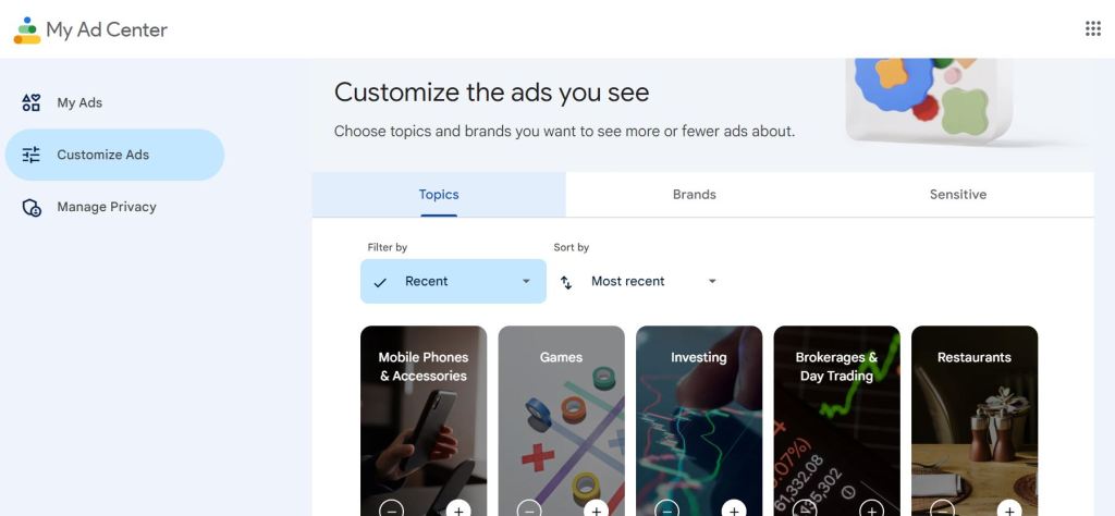
You can adjust the ads by Topics (bulk manager), by Brands (specific manager), or by Sensitive (topical manager). You don’t want to see cars anymore? You can. You want to see more phones? Sure. But true to form, Google/YouTube only pre-screens topics and brand names to certain sets, so you couldn’t really search or specify the parts you have no more interest in, but I’d take this over nothing. So every 2-3 months, I manually review these and compare to my homepage, and after a week I know which topics and brands to avoid for ads. I zealously manage this part.
And that’s not all. YouTube also tracks the ads you’ve seen. So on the same My Ad Center, you can click “My Ads” and scroll near the bottom until you see “Your recent ads“:

For example, if you come across the ETH peddlers that somehow still exist, you can instruct Google that you do not want to see any of them anymore. I also use this tool to screen my previous ads. Sometimes I go straight here whenever I see a bad ad in YouTube, and immediately click the minus button. Right away, or sometimes I just screenshot it via phone and manage it later when I’m on a laptop at home.
Another tool to make your YouTube homepage experience a whole lot better is using the videos’ internal options. These are available for users to tell YouTube’s algorithm which channels suck ass from their end. Granted, it’s not topic-based. It’s more channel-based. But again, something over nothing. Where else would I go for actual mass global content, DailyMotion?
Click on the three vertical dots on the video you don’t want to see again, and select either “Not Interested” (if you want to tell YouTube to not put that specific video on the homepage again) or “Don’t recommend channel” (blacklist it off your algorithm recommendations, basically the difference between “go away” and “fuck off”).
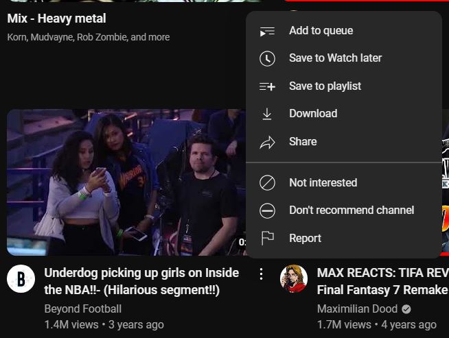
I usually choose “Don’t recommend channel” because I foresee a future where YouTube might use “Not interested” as a firm topic measurement and I don’t want to make my homepage into a bubble. I love reading topics from many sides. It’s just that some people are clearly out of their minds trying to farm engagement by being edgelords, so I just usually use channel-based limiting options. Hopefully I’m wrong on the topic part, though. But if it comes between that and making more money, I guarantee YouTube will choose money.
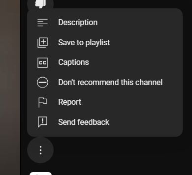
Unfortunately, the “Don’t recommend channel” option does not extend to their homepage Shorts. Only the “Not Interested” option exists in the homepage. If you really wanted to block a channel from your Shorts, you have to click the offending Short video, locate the menu option on top of the channel logo/icon (it’s the three vertical dots again), and click the “Don’t recommend this channel” option. It helps. I wish they had that option right away in the homepage, though. So many cringelords to block.
I’ve used both options since YouTube debuted their Shorts videos, and so far I like it. Mostly from channels I like/follow, plus lots of cat videos. It still helps somehow, that’s the takeaway. Might be few, might be a lot. Still, there you go.
I am highlighting these ad and video options because these are the two ways you can make your YouTube viewing a vastly more pleasant experience. Granted, they’re not perfect nor option-rich. Blocking channels can be tedious and/or exhausting. YouTube has a whole lot of room to improve. But just saying, YouTube has no incentive to do so. Likely these options are here, especially the ads’ options, to satisfy the bare minimum for regulators. There’s no money for them if they allow customers to mass block a whole bunch of ads, videos and stuff. But as far as me goes, again, I’d take something over nothing. They still end up mostly effective for me, at least from my experience, can’t say the same for others doing similar things. Using them a LOT helps a LOT too. Think of it as exercise – you only see the benefits if you do it on the regular.
Because guys, I found that the dislike button doesn’t really help anymore (maybe it does, but likely very very minimal). Back then, I used to hit the Dislike thumbs-down button in videos a lot. Video’s shit, there you go. But ever since YouTube removed the count number for dislikes, I knew the game right away. That shit’s inconsequential anymore. So for me, the “Not Interested” and “Don’t recommend channel” options became my new Dislike button on the homepage. I hope those options extend to the Search results someday, but for now, these will do. I use it a lot to help my homepage. YouTube can easily pull data for things I like, but it can’t read my mind for what I truly dislike. So I have to help it a lot. Any option it gives me to reinforce that dislike, I’ll take it.
And yes, I saw that Mozilla study done years ago, but I took it with a big handful of salt because they did not have access to the actual YouTube algorithm nor full insight on how the algorithm really took into account user actions. It’s all guesswork based on external tools and methodologies on testing a platform’s system actions over a short period of time without full intrinsic knowledge of the system. Mine took years for the algorithm to know what I really liked. I started blocking and using the options back in 2015.
Thumbnails and Titles
Now this is where I have stronger opinions with. Homepage at least has options for me to make it better-looking and better-serving, but when it comes to thumbnails and titles… there’s no safe option. You’ll see awesome and dogshit on the same line, and it sucks.
Thumbnails and titles are usually the gateway for me to watch a video. I am more likely to click on a well-made, well-intentioned video if their thumbnail and title leaned on my likes and preferences. It’s completely a personal thing. We all have preferences.
That said, let’s start with some. I put a rank on each of them.
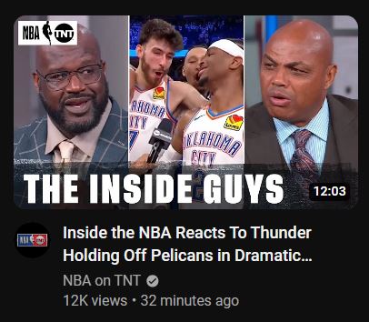
The above one from NBA on TNT is an example of a very good thumbnail. You got the figureheads talking about the game, check. The OKC guys are in the middle, check. So the thumbail shows to the viewers instantly what the video will be about. Those pictures of Chuck, Shaq and the 3 guys from OKC were from the actual show and the actual game as well. No stock images of any of the commentators doing the “shocked face” baloney. The text “The Inside Guys” is good enough, prominent and used a good font with a semi-transparent background. Logo is present on the upper left, not too small and not too big. The thumbnail’s clean. Looks good on both white and black background. Title is also good, no lies detected. It’s a bit long for two lines but as far as text content and intent goes, it’s OK. All in all, it’s a proper business-formatted video thumbnail and title. 👍👍👍👍👍
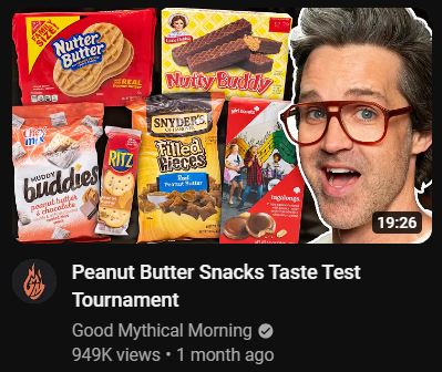
The above one from Good Mythical Morning is a good thumbnail, but engages in some things I truly dislike, just personally – the face template. I’m not sure if the above face of Link was from the video itself and pulled by a crafty editor, but it reeks of “template”. Like he posed for it after the video was shot. Not taking anything away from them, I just don’t like it. But it’s already part of their charm and shtick. I think of it like how The Rolling Stones often play “(I Can’t Get No) Satisfaction” on tours. The background of the packs of peanut butter snacks eaten at the video is OK, good arrangement. No logos or text needed anyway, the thumbnail speaks for itself. Title is also good and honest, short and to the point. Still a good thumbnail and title, but I couldn’t shake off what I disliked. Still watched it though, because I like Rhett and Link and I like peanut butter. Creamy. Chunky can go die in a Long John Silver’s dumpster. 👍👍👍👍

The above one I chose to illustrate how comical overexaggeration can potentially either drive away watchers or attract a lot more watchers. Let’s dispense with the easy elements. Logo’s a bit large, emoji use is meh, the font on the upper right is good – has contrast with the background so it pops out, and the yellow font looked good there as it also looks good with the blue background. Good font used too. The picture of Steve Harvey in the thumbnail looked nice and seems to be pulled out directly from the video, so I’m OK with it. But we start on the nitpick with the censored mouth. It’s a picture. One frame. You can’t tell if he really said “fuck” with a single picture. The thumbnail had it censored so it is made to look like Harvey said the naughty word. But to me, it’s completely useless. The text on the upper right made it evident already. Censoring the mouth is just comical overexaggeration. Next is the title. To me, personally, I dislike YouTube titles having lowercase-uppercase inconsistency in a sentence. If the uploader made the title all-caps instead, I would I preferred it way more. I feel that the lowercase-uppercase horseshit on YouTube video titles (e.g. “You NEED to see THIS!!!”) is baiting. In the above video’s case, it clearly worked. 6.3M+ views is nothing to sneeze at. But for me, sorry, quality’s good but definitely not “that” good. Also, most videos are given only two lines in the list. Like, maybe 65 characters or something. Longer titles IMO serve it detrimentally. So to sum, thumbnail needs work, title needs shortening and less CAPS. Still OK though. 👍👍👍
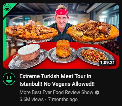
Let me start with: I like Sonny. He’s a more genial and accomodating version of Andrew Zimmern, with a healthy sprinkle of the kind of mentality that does dick jokes on the regular, with a bandanna on the side (maybe his forehead’s big). He’s fun to watch and he always puts his best foot forward, respectfully. The one above is from his secondary channel. I like the thumbnail. Sometimes simple and minimal can be beautiful. He’s presenting Turkish food. The arrangement of the food pictures can be a lot better, but it’s not bad at all. A small “logo” is on the top left corner, nice. However, I am tearing the title down a notch. First, the extra exclamation mark. What’s the difference between “Extreme Turkish Meat Tour in Istanbul!” and “Extreme Turkish Meat Tour in Istanbul!!”, eh? Barely any. I do understand that in informal writing, multiple exclamation points are sometimes used to indicate stronger emphasis or emotion. Sure. But it’s just my personal preference to like “!!” a bit less. I prefer civility in my YouTube titles a bit more. Think of it as preferring donuts with heavy glaze or just simple cinnamon-sugar sprinkling. I like sprinkling more, by the way. Second, the adjacent part, “No Vegans Allowed!!”. I’m not sure the bait-y dig was necessary. Sure, I like a good “pretentious vegan” digs here and there, but only when it made sense. I watched the entire video. Nowhere did I feel that vegans would feel unwelcome in Istanbul. Last I’ve seen, Türkiye loves pickles. So, to sum. Thumbnail good, title is like a pitcher of sour milk. 👍👍👍👍

The one above kind of checks many of the boxes of what makes a bad impression and why you shouldn’t watch the video. The thumbnail is pure clickbait designed to milk maximum anger and outrage over possibly something as offensive as a salad with 5% more calories than usual. Thumbnail shows two people side by side, one presumably the targeted politician with the red circle. Then the font and text, “JUST HAPPENED!” in big letters enclosed in a red background box. The whole thumbnail reeks of tryhard over bad engagement. The title also is disingenuous. It’s obscuring Google’s algorithm by using “Israel” with the “a” replaced by a “@” symbol. It also uses capitalized words, so it’s already down my vote from the get-go. All in all, just another rage bait video that does its best to game the system, but hopefully more people call BS on that kind of content promoting regardless if the video proved true or not. It’s like selling insulin injection pens at 10x the market price. Doesn’t matter if the pen works or saves a life or two, the fact that it was sold at that amount should be a crime. Won’t even link to it, spare you the bait. ❌❌❌❌❌

Above video is from American CNN a couple of weeks back. This is another example of bad thumbnail – again, in my opinion. The red border is gnarly and hideous. Holy flaming horseshit kind of bad. It’s an eyesore in the homepage list.

The CNN logo in the thumbnail is oversized. A 20% size reduction would’ve been better. Text in the thumbnail won’t hurt, because what the hell are we seeing in that thumbnail… a wall with sticks and two cars. We have to read the title text to get the full picture. Maybe some small text in the bottom, like “LA $30M CASH HEIST” would’ve worked. When it comes to title, I have zero problems. It’s a proper headline kind of text. And since CNN is a news media entity, they do know how to make attention-grabbing titles. So to sum: CNN, thumbnail is a donkey, title is a thoroughbred. 👍👍
And to compare it with the BBC over there at good ol’ England…

…they got their set a lot better. Thumbnail, largely alright. Logo, minimal. Text, kind of big but it’s OK. Picture, blurry but still relevant to the topic. Title, same as CNN, they know how to keep it straight. 👍👍👍👍
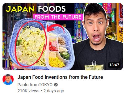
The above set of thumbnail and title is from Paolo fromTOKYO. His content is OK, I’ve watched a couple of his videos before. But I have to use one of his videos as an example of one of the most egregious shits I dislike in YouTube videos – the open-mouth shocked Pikachu face. I don’t dislike it – I hate it. Let’s get the only positive out of the way first – the title below the thumbnail is good enough. OK, back to the thumbnail. Whenever I see these, I refuse to watch it unless the title really really hooks me in to watching, or it’s from GMM. For this one above, hoo boy, sorry I have zero desire to watch. I dislike the open-mouth thumbnail face, the use of the pink background in the text “FROM THE FUTURE” sucks as well, and the “JAPAN FOODS” is misleading to say the least given the actual title says it’s about “Japan Food Inventions”. So, it’s bad that I don’t want to go further. Hope the other 210K liked the content, though. 👍

The one above is from Lex Fridman. And I must say, it works, I kind of like it. Simplicity is rare and hard to pull off. No logos, no text. It’s just two side-by-side pictures, but “craftily” arranged too, it told things without text. Not great thumbnail, yes, but pretty damn far from bad. The title is also to the point. Very rare among many YouTubers who tend to cram their titles with so many unnecessary words. 👍👍

The one above is from a channel that covers geopolitics and many things military-related – “Task & Purpose”. That said, again, this is a completely personal preference – I absolutely HATE this thumbnail format as well. I hate it when the content creator tries to frame themselves in the middle of their video, as if they are an “arbiter”. In this instance, he framed a thumbnail stock image of himself between two images pertaining to the currently-brewing Israel-Iran conflict. The thumbnail doesn’t look good at all. Coupled with the text above it, “ISRAEL vs. IRAN STRIKE”, in big unattractively-set position and size, it just reeks of trying to draw in views other than trying to give an honest and unfiltered take of the situation. I’m sure he has some good views covered in the video, but the distaste left by the crappy thumbnail made me not proceed to watch. And that dead stare used for the thumbnail… the whole thing just lacks personality. Like somebody cobbled together some pictures and used a template. And I dislike the title as well. I get it, he’s trying to draw viewers in, but IMO the title is cheap cocktease. It’s not damning, but I’d rather watch other videos. 👍
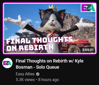
The one above is from Easy Allies, a channel that does great reviews and critiques of games, with some panel talks and podcast-esque discussions. Their logo is on the upper right, and it’s just the right size. Font used in thumbnail is OK, doesn’t really take away from the background and made brief to convey what the intention is. Background is OK as well, everyone loves cute cats that animate like Mickey Mouse. Like CNN, their thumbnail has borders too. But unlike CNN, the editor clearly chose a two-color border – the darker violet outside and the white border inside, giving the illusion of a “smaller” video thumbnail but with a hint of violet highlight. And the combo of colors aren’t desperately screaming for attention either, that’s good. Title is good, it conveys what the video will be and who will be on, although they should’ve used “Final Thoughts on FFVII Rebirth w/ Kyle Bosman – Solo Queue”. Small nit, but the thumbnail and title is very good. 👍👍👍👍👍
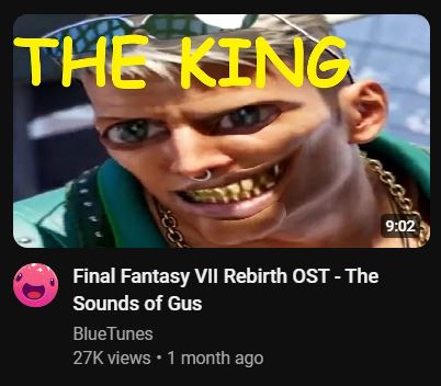
The one above is one of those channels whose provenance is making videos with game OST music. Just saying, I do peruse a lot of these channels, but I do have some minimum criteria – effort, crediting the musicians, and respecting the source material by linking the game. Lots of channels do all three. I used this channel as an example, because this one does none of those (yet).

The thumbnail above already speaks for effort – technically it’s there, but it’s pure weeks-unwashed butthole. Also, no respect to the source material. Hope they at least link the game, as soon as they could. Most YouTubers do, like the one below. Some add credit thru the description as well.
The reason I get a bit antsy about these kinds of shitty channels is that these channels aready exist in a gray area in the law, of whose existential provenance is the largesse of the IP holders. Lots of people with no Spotify or Apple Music use these channels’ content to listen to these things as well. Just saying, if people actually fully understood what “fair use” meant, they’d stop using it as a shield a lot. So if that is the case, the minimum these channels could do is at least do not try to piss any of the IP holders off or give them ammunition to nuke the channels. In summary, thumbnail not as worse as clickbait videos, but definitely making up for it with half-assing a lot of the other things. Video title does not reflect the music’s proper actual title, therefore inaccurate. ❌❌❌❌
And speaking of channels whose content is just taking from other sources…
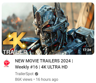
The one above is from a channel called “TrailerSpot”. Thumbnail doesn’t say what it has in store for the viewer, aside from an overly-stylized “4K TRAILER” indication on the lower left. Basically take a picture, slap a logo on the video, that’s it. One could argue for simplicity, but what’s going against it is that there’s nothing to pull out of the thumbnail except “4K” and “Trailer” because a good number of people won’t know where the background’s from.
Thumbnail and title barely tells shit to the user. I don’t even know what the above picture’s background is, maybe Transformers? Part of what makes a good thumbnail and title is telling the users within seconds what they’re going to be on if they watch the video. Movie trailers, sure, with an “s”. Of what? If people have to spend more than 3 seconds to decide if they want to click or not, it’s not a good set of thumbnail and title, in my opinion. Because clearly, 86K fell for the venus flytrap. ❌❌❌❌❌
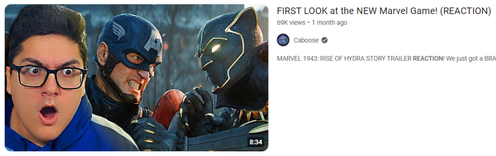
The video thumbnail and title above is from a channel named “Caboose”. And this is an example of the most overused and most template-y shit I hate, the “reaction face”. Open mouth, wide eyes, shitty-ass shocked Pikachu face. This is different from the “template face” that GMM employs for Rhett and Link, I got used to it but I still wish they move away from that template shit someday. And for the above one, I don’t like it. Something feels off for me when I look at it. Title is also using the “caps” thing, exaggeration of words. Also me no likey. So, for the video above: thumbnail, no good. Title, barely any better. 👍
OK, let’s face the fact – it’s the YouTube economy’s fault that many do use the shitty template face with the reaction.


I get it. It does grab attention, it increases click-through rates and viewer engagement, and most of all, it brings in the good ad revenue shit that makes YouTube executives wet in the pants. Yeah. Make shocked face, put background, use as thumbnail, exaggerate the title words, and voila, see the views go in, because there are people who will be interested to see what the face might be reacting about. Almost everybody does it. My favorite YouTubers do it too. I kind of am pissed about it but what can I do? It’s the name of the game in YouTubeland. Fake-ass reaction face. Surprised, shocked, dismayed, facepalm, thinking, angry. I just wish there was a better, more decent one as “the game” instead of this shit, in my opinion.
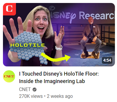
And… last. And I saved one that I’d love to have for a small dessert. This one is from CNET. And it’s hella cringe. It always makes me cringe when news media (at least the lesser-known ones) starts to act like many of the piss-poor shameless content creators on YouTube raking in 500K views and crib some of the things they do. Template face, check. Open-mouth open-eyes crazed face look, check. At least they still adhered to some fig leaf of decency by their logo being a small part on the upper left and using actual image from Disney’s Imagineering labs, and putting “HoloTile” on text. Title is also decent. But it worries me that they are starting to play the YouTube game, based on the videos on their channel over the past few years. I looked at more of their thumbnails, and it seems “cringe” might really be their new method for views. 👍
Final thoughts
- YouTube could do a lot better to help users make their homepage and viewing experience be much more reflective of their preferences without enclosing them in a self-made bubble, but I also understand it comes at the expense of some ads and engagement numbers that they need to be “operational”.
- Subsequently, users should abuse the ad filtering options YouTube provides (albeit they do a good job making them inconspicuous and devoid of specific fine-tuning) and pre-screen the ads they see. I mean, they’ll bombard you with ads anyway, might as well make them the ads you have the least of problems seeing more often.
- Users should “train” their homepage algorithm as well, if possible do it regularly. If you see a video you deem terrible/offensive or don’t like to see anymore, hit the “Not Interested” or “Don’t recommend channel” options right away. But feel free to have a second opinion – check their channel if it’s just a one-off or there’s more good than bad. But those options will make some difference, as you’ll see more of the things you really like and then some.
- For YouTube video thumbnails, I do prefer it to be these things: eye-catching, good text (including font, color and size), relevant background image/s, minimal logo size, non-clickbait text, and non-cringe creative use of the creator’s face (e.g. cartoonization, touched-up, et.c).
- For YouTube video titles, I do prefer it to be these things: concise, non-exaggerated, truthful, and informative. It’s a tricky tightrope to walk on to, but I respect the creators that manage to do so.
- I still hate the YouTube economy on thumbnails – the “reaction face” template with the exaggerated expressions. I get it that it’s the biggest game in YouTubeland, gets creators their clicks and engagements, and helps put the fuel in the yachts of certain rich executives, but in my complete personal opinion, it’s bad.
- I do have massive respect for creators that barely or never use that “reaction face” thing and make effort to make their thumbnails neat, clean and can stand out without resorting to the easy cheap way.
- Whenever media/companies try to hop onto trends, you know it’s the beginning of the end of that trend. I hope someday CNN puts Anderson Cooper and Wolf Blitzer in thumbnails doing the cringe shocked face while pointing at the background like bozos. Hell, I hope some big company with videos and ads on YouTube might make theirs mega-cringe, like Ajit Pai’s mug. So that some creators may be moved to do less of the “reaction face” thumbnails.
On second thought, they’re starting to catch on. - It took me many years to make my YouTube homepage fully feel like mine. So I’m not surprised that Mozilla’s study said otherwise, because likely their study only took months, maybe a year perhaps. Just saying.
- But for the foreseeable future that we have to live with the “reaction face” dookie of a thumbnail template, I just had to tighten my personal preferences and make begrudging passes for channels that had content I like but also had to engage in thumbnail buffoonery. For the channels I subbed to, I just try to not give much attention to the thumbnails anymore and just look at the title if I have to watch or not. Like a mall toilet with vandalism written on the walls. Still have to use ’em, just piss and don’t look around.


Leave a comment